
Wednesday, April 20, 2011


Creative solutions to poster problems.
We were originally having trouble coming up with an idea for this poster so me and two other friends decided we would be more successful if we collaborated together and created an ad campaign. The plan was to make a series of ads and link them together when we posted them up on our blog. The way this would work is each ad would have a QR code that would send you to a specific blog post which would contain all three ads. We chose the theme monster movie marathon and we each created a different ad based on our "predator" assets. For my ad, I used my purple monster from my skateboard design and decided to call it "The Thing". Taking ideas from previous posters, I decided on making the design mostly in black and white to give it that old classic movie feeling. I also played around with effects until I got a sort of an old tv effect on the monster. I searched around for fonts that would go great with my idea and stopped on the font, Feast of Flesh, which I downloaded off of dafont.com and then played with a couple of blending options to give it more emphasis. I decided on emphasizing the text by adding a female character screaming whilst looking at it, and made her purple to add some colour and mix and match with the text as well.
Story
In a school full of irresponsible students, comes a purple thing which begins harrassing students on campus. The monster's unquenchable thirst for blood grows every day until one day, a few friends decide to go to the swamp and confront him. After endangering their young lives to better get to know the monster, they realize that the thing is a lot more vicious then they ever imagined.
Tuesday, April 19, 2011


Saturday, April 16, 2011
Poster ideas
Over the recent weeks, I've been watching a few horror classics and was very intrigued by their style. I was having trouble coming up with an idea for this poster project so I decided to collaborate with a friend and do monster movie marathon. I checked up on google and saw a few inspirational posters that I can grab ideas off of.


Wednesday, April 6, 2011


Monday, March 28, 2011


Sunday, March 27, 2011
Hai menu
In class we were given a task to paint a soy sauce painting and use this asset to create a menu for a restaurant.
Here is my final product:


Here is the the soy sauce assets used to create this:

Here is my final product:


Here is the the soy sauce assets used to create this:

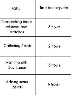
Here is my time sheet.

Sunday, March 20, 2011


Monday, March 14, 2011


Wednesday, March 9, 2011
Jack it up - 24 ad
For my DMA234, computer graphics and imaging, class I was to make and resize the 24 banner ad in 5 different ways. Here they are:
 |
| 240x400 |
 | |||
| 120x600 |
 |
| 300x250 |
 |
| 468x60 |
 |
| 728x90 |
Tuesday, March 8, 2011


Monday, March 7, 2011
MinSkoa71 - Shoe advertisement
Minskoa71 Story
Tommy went to Rucker Park everyday. He wore the same white shirt, the same blue shorts and the same old beat up basketball shoes. When teams got picked for basketball, he was never chosen to play. The other players said that he was too short or too fat to play with them. This made Tommy sad, but he didn't give up. He tried to create something that would give him an edge in the game and so he created a shoe that would help him. So one Tuesday morning, Tommy came back to Rucker Park with the same white shirt, the same blue shorts and the MinSkoa71 Earthquakers. He stepped onto the court and challenged all of the boys to a 10 vs 1 game and won. MinSkoa71.
Concept
I tried to base the shoe ad on the story. The background,which is Rucker park, is faded gray to give it the illusion of memory. The blurred copy is there to create the illusion of an earth shaking design. I tried to use the splashes in a way that it looks like the back of the shoe hit the floor and a ton of beautiful splash marks came out from it.
Final Outcome

Sunday, February 27, 2011


Sunday, February 20, 2011


Sunday, February 13, 2011
Texturama - week 2 - 6
Sorry guys, been kinda busy and have been slacking on posting up some textures, but as a treat, I'm going to post up 15 textures this week, yes that's right I said 15! enjoy


These textures are all free, however if you use them, please put credits to Jeffrey Saguros. Thanks.


These textures are all free, however if you use them, please put credits to Jeffrey Saguros. Thanks.
Subscribe to:
Posts (Atom)